Colour Theory
The Colour Wheel Explained: A Practical Guide
Learn how the colour wheel is organised and how to use it to build balanced, expressive colour schemes.
Practical guides, colour theory, palette ideas, and design inspiration for interiors, fashion, branding, and creative projects.
Explore colour guides ↗Browse combinationsUnderstand the principles behind colour, then apply them to real spaces, wardrobes, visual identities, and creative work.
Understand the colour wheel, hue, value, saturation, harmony, and the relationships that make colour combinations work.
EXPLORE TOPIC ↗
Explore complementary, analogous, triadic, monochromatic, and neutral colour schemes with practical matching advice.
EXPLORE TOPIC ↗
Choose wall colours, furniture accents, and room palettes that respond to light, materials, room function, and personal style.
EXPLORE TOPIC ↗
Coordinate clothing colours, understand undertones, build versatile wardrobes, and experiment with personal style.
EXPLORE TOPIC ↗
Use colour intentionally in logos, brand systems, presentations, and digital design while considering contrast and accessibility.
EXPLORE TOPIC ↗
Use simple browser-based colour tools, understand HEX and RGB values, and learn how to evaluate palette contrast.
EXPLORE TOPIC ↗Learn how hue, value, saturation, contrast, materials, lighting, and proportion work together. Our guides turn colour theory into practical decisions you can test and refine.
Clear introductions and useful examples to help you make confident colour choices.

Learn how the colour wheel is organised and how to use it to build balanced, expressive colour schemes.
Understand warm and cool colour families, the moods they can suggest, and how temperature affects a palette.

Learn the three essential attributes of colour and how changing each one affects a design.
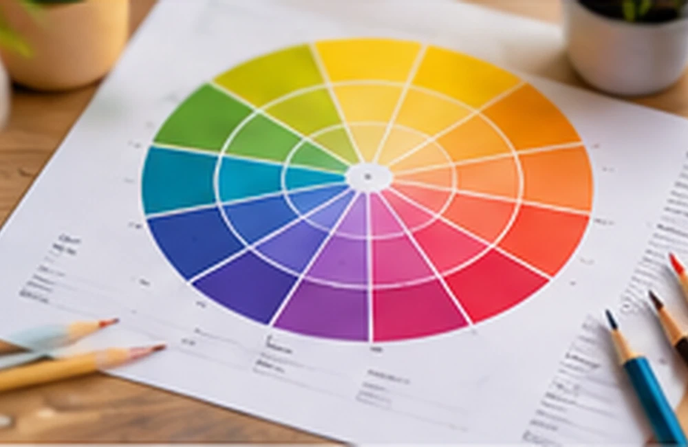
Discover how opposite hues create contrast and how to balance complementary colours without overwhelming a design.
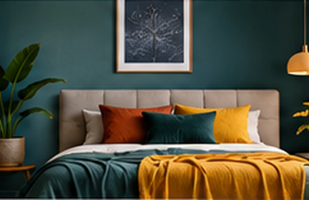
Learn how neighbouring hues work together and how to add enough contrast to keep an analogous scheme interesting.

Build a refined palette from one hue by varying its tints, tones, shades, and levels of contrast.