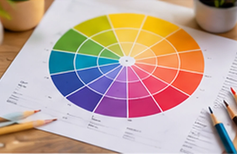
What complementary colours are
Complementary colours sit opposite one another on a chosen colour wheel. Common examples in traditional design discussions include blue and orange, red and green, and yellow and violet. The exact appearance depends on the colour model and the specific hues selected.
Why the relationship works
Opposite hues create strong visual contrast. Used carefully, that contrast can make a focal element stand out and give a composition energy. Used in equal, highly saturated amounts, the same pairing can become visually tiring or compete for attention.
Balance with proportion
A useful approach is to let one hue lead and use its complement as an accent. You can also soften one or both colours with tints, shades, or muted versions. Neutrals and natural materials help create breathing room around a bold pairing.
Practical examples
A deep blue room can use burnt orange in cushions or artwork. A green identity can use a restrained red accent for a campaign highlight. For a website, avoid placing two intense complementary colours behind small text; use them for larger blocks, illustrations, or carefully controlled accents.
Frequently asked questions
What is a complementary colour?
It is a hue positioned opposite another hue on a colour wheel.
Do complementary colours always look good together?
They create strong contrast, but the result depends on saturation, value, proportion, and context.
How should I use complementary colours?
Choose one dominant colour and use its complement in smaller accents or softened variations.
Keep exploring
Browse more colour combinations guides or return to the ColourMatching.com home page for more practical colour resources.